When selling a book, you literally have a few seconds to catch your potential reader's eye. There is no better way to do it than with a striking cover. As an indie author, you have the creative freedom to design it how you love. But what should the cover look like to be the best marketing tool?
Today's guest post is by Vasylysa with Miblart. Miblart has been designing covers for over seven years now with unique expertise about what works best for each genre. Welcome, Vasylysa!
Everyone wants a book cover they love. The problem is that as the author, sometimes you're focused on small story elements instead of the overall impression the cover gives your reader. Your cover needs to make a promise to the reader about what's inside and what to expect without delving into details.
Think about your favorite book cover. What does it communicate about the story? What elements does it use to convey that information?
Today you’ll learn how to choose a typography style, color palette, and imagery for your irresistible book cover. We’ll also show some iconic book cover examples and offer you ways to practice a bit. Let’s start.
Importance of Book Cover Design in Attracting Readers
People say not to judge a book by its cover, and that might be great advice when we're talking about making friends. But when talking about real books cover design matters. Moreover, a study by Thriftbooks shows that 57 percent of Americans choose a book by its cover design.
Here are some reasons why a book cover is crucial in attracting readers:
- First impression. It is the first thing people see, whether browsing in a bookstore or scrolling through online book listings. Thus, a visually appealing cover can make a strong positive impression and ignite a reader's curiosity.
- Emotional connection. Well-designed art evokes emotions and ignites intrigue. Readers might feel a sense of excitement, curiosity, or even nostalgia when they see a cover that resonates with them mentally. This emotional connection can motivate them to explore the book further.
- Plot hints. Visual elements lift the curtain on the book’s events and settings. For example, readers who like stories about epic battles and mythical creatures will pay attention to the cover with swords, dragons, and castles.
- Proof of high-quality content. People often associate a professionally designed cover with higher quality and care in the book's production. If the cover looks fantastic, the story inside must also be captivating.
- Word-of-mouth machine. Readers love to share beautiful covers on social media so their friends can see them and become interested. Such posts can become a conversation starter, helping to generate buzz and interest in the book.
But how to create a book cover that will accomplish all of that?
Elements of a Successful Book Cover
Each appealing cover features three main design elements: typography, color palette, and imagery. Let’s find out how to choose fonts, hues, and visuals that work best for your story.
Typography: Choosing the Right Font and Layout
When choosing a typography style for your cover, you should consider the book's mood and genre.
Yes, fonts can also evoke emotions and set the atmosphere. You've probably noticed that:
- Scripts feel playful, romantic, and informal
- Sans-serifs look severe and stern
- Serifs set the mood for fantasy and mysterious worlds.

Script (Romance) |

Sans-serif (Mystery) |

Serif (Fantasy) |
Book cover design by Miblart
Besides, each genre has specific standards for typography. There's a reason it's impossible to find a non-fiction cover with an ornate serif decorated with curls and enhanced with glowing effects.
Readers also have these expectations about fonts when choosing a book to read. They usually want to see:
- Elegant serifs for fantasy
- Bold sans-serif for science fiction, horror, or suspense
- Delicate scripts for romance.
Take the time to study the top book covers in the genre you're writing in, so you can deliver something that draws the right readers to your story.
After determining what emotions you want to convey to your readers and researching the font trends of your genre, you won't go wrong when choosing a typography. You can also make text elements more appealing by adding effects, such as glowing or metallic sheen for some genres.
Colors: Creating an Eye-catching Color Scheme
Already know your story’s mood? It will help you choose not only the fonts but the color palette. Each hue subconsciously evokes certain emotions in a person. This is vital because readers are not just looking for unique and captivating plots. They want to go through the desired emotional experience not available to them in real life.
Let’s explore how colors work in particular:
- Red stands for passion, dominance, and energy. But it’s also associated with danger, rage, blood, and murder.
- Green often hints at vitality, magic, and paranormal phenomena.
- Blue is a color of miracles, peace, calmness, and relief. It can also mean intelligence and severity.
- Purple is undoubtedly associated with fantasy worlds full of magical powers and wonders.
- Pink relates romance, youth, dreams, and desires.
- Black means authority and power, as well as dark side and depression.
Your cover can be monochromatic, focusing on the vital emotion of your book. However, it can also have a colorful scheme, hinting at different moods while reading. But avoid overwhelming the design with too many hues or bright colors which can be overwhelming. Typically, it's better to stick to a limited palette, perhaps two or three primary colors, to maintain visual cohesion and simplicity.

Red is about energy and passion, while greenish blue hints at a magical atmosphere. The darker shades create an atmosphere of mystery. |
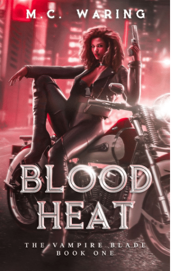
Shades of red stand for power, dominance, danger, and vampire theme. The contrasting white and steel graycolor makes the typography stand out. |

The colorful tree hints at a story that spans different times. Red and pinkhighlight the romantic theme, while yellow and orange set a cozy atmosphere. |
Book cover design by Miblart
Imagery: Selecting Compelling Images That Resonate with the Book's Content
Okay, now you know how to choose the perfect font and color palette. But what exactly should you depict on the cover? After all, you can literally show anything thanks to endless stock images or custom illustrations.
Follow these tips to find out what visuals to prefer:
- Think about your genre again. Like fonts and colors, readers expect specific imagery in their favorite genres. For example, romance usually features couples or love attributes, while fantasy covers have magical artifacts or fairytale castles.
- Identify key themes. Think about the book's central themes, characters, or important scenes. What visual elements could convey or represent these things effectively?
- Add symbolism. You should define any symbols or objects that are essential in the book. Such symbols on the cover can intrigue readers and encourage them to buy your book.
Aside from choosing what to depict, it’s vital to know how to get the most out of images and avoid any issues. Here are some things to consider:
- Pay attention to the balance and composition of the image within the cover design. It should be visually pleasing and not too cluttered.
- Always choose high-resolution images that are clear and sharp. Blurry or pixelated photos can make the cover look unprofessional.
- If you're using stock images, ensure you have the licenses and permissions to use them for commercial purposes.
Iconic Classic Book Covers
If you want more insight into creating marketable book covers, research popular and successful designs that have already won thousands of readers’ hearts.
Analysis of Famous Iconic Book Covers
Let's start with the iconic covers that you've probably seen. Have you ever thought about what makes them appealing?
The cover design for Harper Lee’s novel To Kill A Mockingbird is simple yet effective. It was created by Shirley Smith. The cover portrays the tree where Scout finds the trinkets Boo Radley left behind for her and Jem. (May also be the tree where the children are attacked.)

- The typography used for the title is serif, which gives it a classic and formal look.
- The contrast between the vivid green and the darker background colors creates a striking effect.
The first cover of F. Scott Fitzgerald's novel The Great Gatsby looks into the readers' souls. It features Francis Cugat’s artwork Celestial Eyes. Before you read the book, you wonder whose eyes are watching. By the end, you realize those eyes might be Daisy's eyes or any of the various types of voyeurs in the novel, each with faulty vision.

- The typography is elaborate and ornate, with a cursive, decorative style that exudes a sense of the Roaring Twenties' extravagance and flair.
- The color palette combines deep blue and vibrant yellows and oranges. These hues suggest luxury and excess, themes central to the novel.
The cover for J. D. Salinger’s novel The Catcher in the Rye is eye-catching and thrilling. Why does it include an image of a horse?
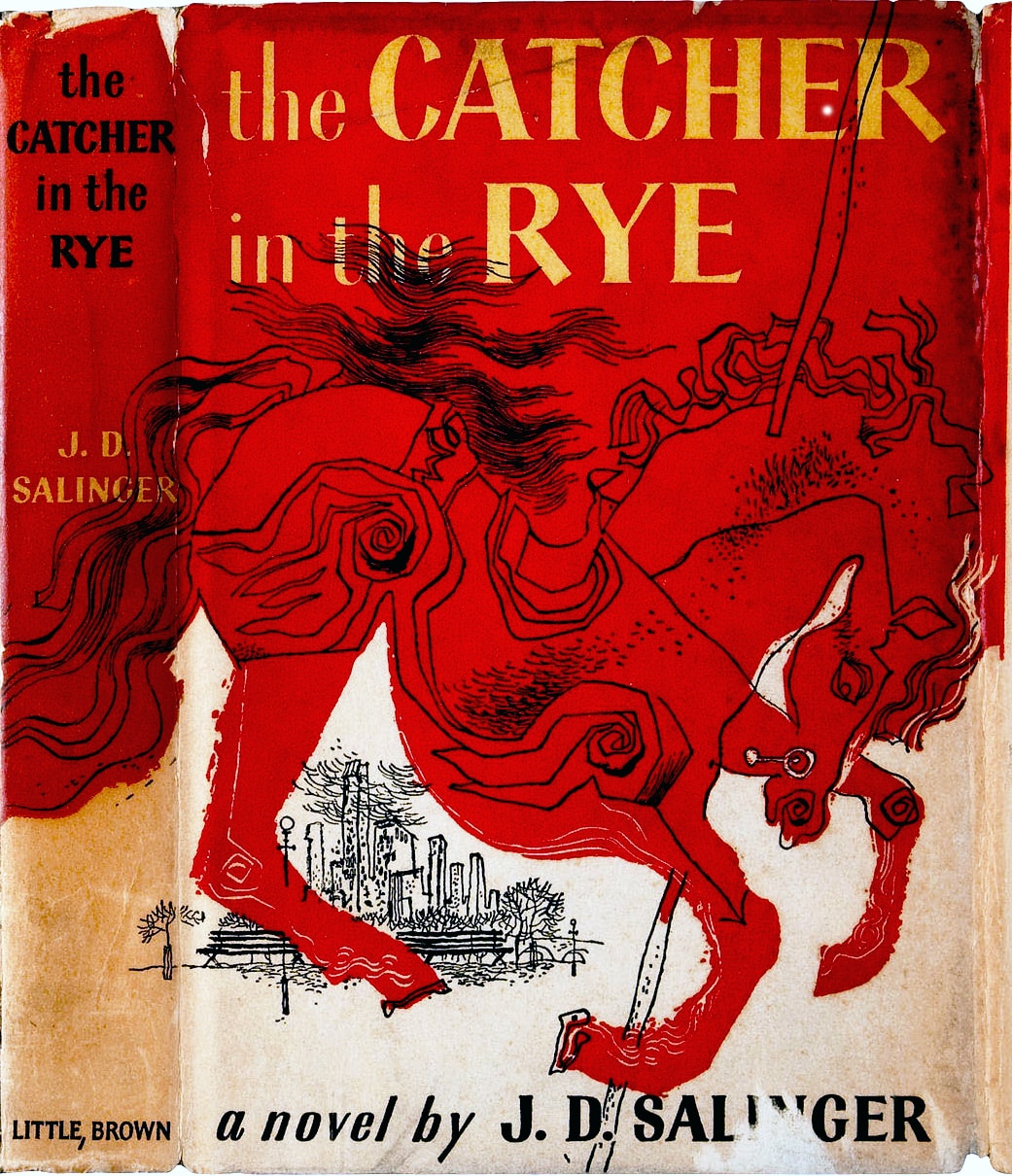
At the start of the book, the main character, Holden, comments on an ad for his school showing a man on a horse leaping a fence. Since the school has no horses, he thinks the picture symbolizes how the school helps boys ‘jump the fence’ into adulthood and become men. But Holden is stuck between being a kid and an adult, shown by the image of the carousel horse against the smaller line drawing of the cityscape.
- The title's bold, blocky serif typography stands out against a vivid red background.
- The color scheme is primarily red with black outlines and white spaces, giving it a stark and eye-catching contrast.
Contemporary Masterpieces: Recognizing Outstanding Book Covers
Now, it’s time to move on to modern book covers that immediately grab readers’ attention.
The book cover for Rachel Gillig’s fantasy One Dark Window intrigues readers at a glance.
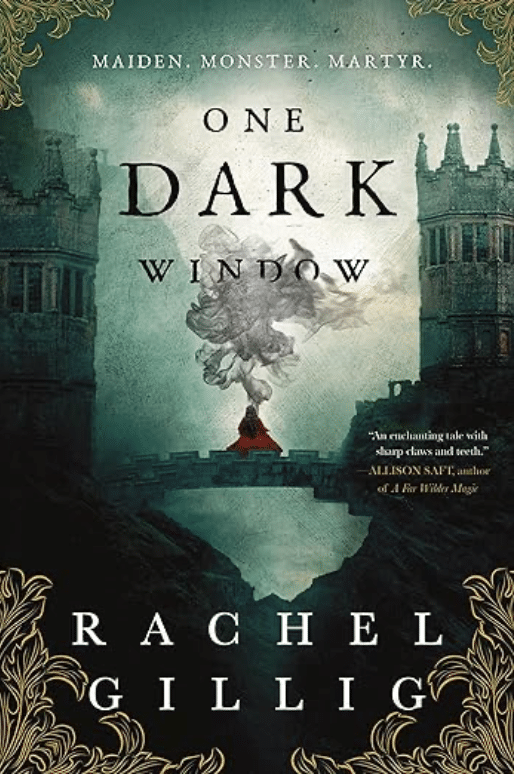
- It features a woman in a red cloak standing at the edge of the bridge, facing a large, dark, and ominous-looking tower.
- Her contrasting look stands out against a gloomy background.
- A serif font that's both elegant and readable enhances the fantasy atmosphere.
- The color palette is moody, with dark greens and blacks dominating the scene. The red of the woman's cloak stands out against this backdrop. Golden floral details at the bottom add a touch of elegance.
The cover design of Ayesha Manazir Siddiqi’s mystery and suspense The Centre presents an intriguing mix of visuals.

- A vibrant assortment of flowers contrasts starkly with a human skull.
- Large, bold sans-serif letters span across the cover and are interrupted visually by the central imagery.
- The palette is rich with dark tones, primarily black, which serves as the background, allowing the other colors to pop.
The cover of the thriller Murder Your Employer: The McMasters Guide to Homicide by Rupert Holmes boasts an appealing and elaborate design.
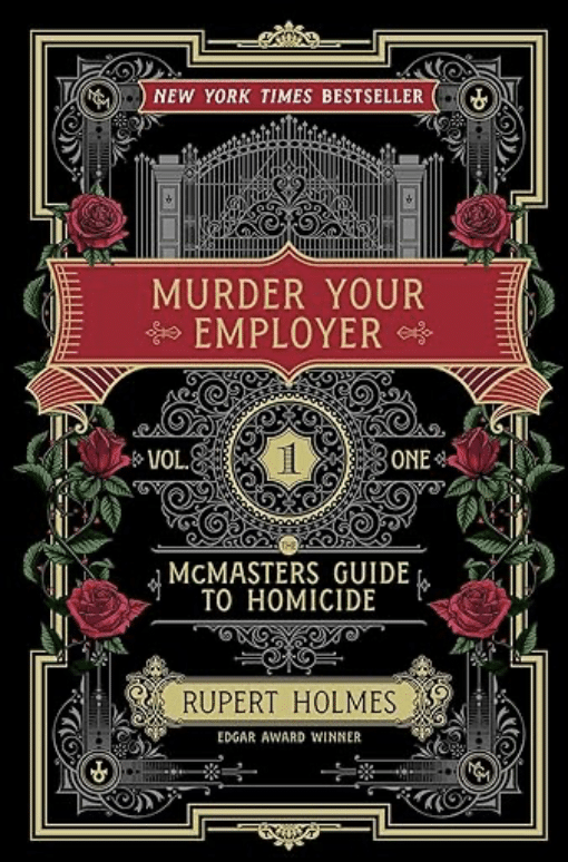
- An ornate gate is the central element. Red roses are also intertwined with the gate, symbolizing secrecy and danger when considering their thorns.
- The typography style uses a mix of serif and sans-serif fonts that give a vintage or classic feel.
- The color scheme features black, gold, and red – a classic combination for thriller books, implying elegance, wealth, blood, or danger.
What Cover Does Your Book Need?
Let's recap the above tips and define some basic rules for creating the perfect book cover for your story.
1. Analyze Your Target Audience
Before designing your book cover, it's crucial to understand your readers. Who is your target audience? What age group are they in, and what are their preferences? Take some time to research and identify the visual elements that appeal to your potential readers.
2. Find Out What Works for Your Genre
Different genres have specific standards and trends. Analyze successful books and identify common themes, colors, and styles. Miblart boasts a diverse portfolio with book covers where you can seek examples, references, and inspiration for your future design.
3. Choose the Book Cover Type
There are several types of book covers to consider, such as character-based, object-based, and typography-based. Moreover, design can be minimalist or ornate. Your choice should align with your book’s genre and plot.
4. Add an Intriguing Hook
Your book cover should create curiosity and spark interest. Think of a captivating tagline, quote, or imagery that hints at your story’s essence. This hook should entice readers to immerse in your book but not reveal too much. (Keep in mind what will show when it's seen as a small thumbnail in an online store.)
5. Test Your Cover Design Concepts
Create a few different cover concepts and gather feedback from friends, beta readers, or potential readers. You can do it on social media or in a newsletter. This will help you understand which design resonates the most with your audience.
To Wrap Up
A marketable cover is a must for indie authors who want to attract readers and encourage them to buy their books. It creates the first impression of the story and hints at the plot and emotional experience the readers can get.
But an effective book cover is not just a pretty picture. A detailed analysis of the story's genre, mood, atmosphere, and themes stands behind it. This information is crucial for choosing the perfect typography style, color palette, and visual elements.
What is your favorite cover and why? Tell us in the comments.
PRACTICE
Choose a book cover in your genre–preferably one you haven't read.
Set your timer for fifteen minutes. Describe the emotions, mood, and atmosphere that the cover creates. Then write a catchy blurb, imagining what the story could be about based on the visual elements.
Share your practice (and the book title!) in the Pro Practice Workshop and give feedback to a few other writers.
This article is by a guest blogger. Would you like to write for The Write Practice? Check out our guest post guidelines.

0 Comments